Contact Center by Contrast takes the power of one of my favourite iOS apps and simplifies it so that it can be utilised by a wider audience.
I’ve been a long time admirer of Launch Center Pro, an application which allows you to chain multiple apps together to form complicated workflows in order to aid your productivity. It is exactly the kind of app that a Power User wants to take advantage of. However, it only appeals to a very niche sub-section of the iPhone user base. Just trying to explain the concept of a URL callback scheme to friends and family is enough to make them run a mile.
Contact Center removes this layer of complexity and offers a far more simplified method of interaction with the end user. At it’s heart, it still chains workflow elements together, however there is no detailed configuration, no URL schemes to find. Instead, Contrast have decided to abstract these elements into a highly intuitive user interface that anyone can pick up and play with. Instead of chaining applications, you chain contact information and the results can lead to some significant time savings.
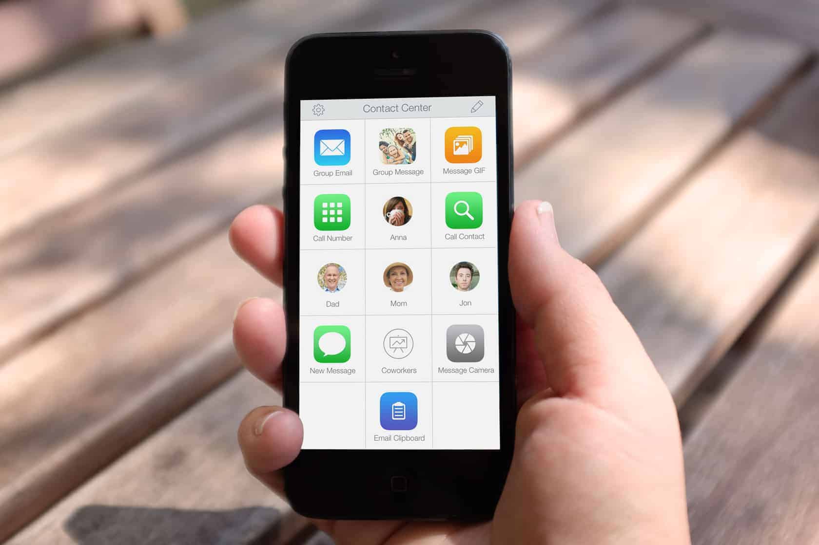
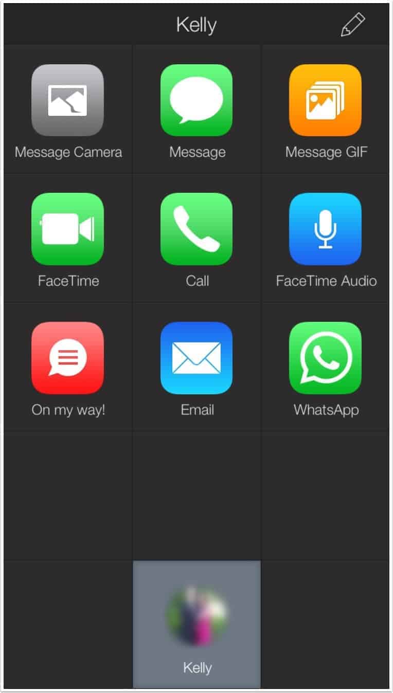
In it’s simplest form, Contact Center acts as a speed dial pad for your iPhone and this will represent the majority of use cases. There is a very intuitive tutorial screen which allows you to place your favourite contacts on the Home Screen, so the non-power user has definitely been catered for. By clicking on the Edit pencil in the top right hand corner, you can configure one of the twelve tiles (fifteen if you pay the $2.99 in-app purchase fee) to be either a Shortcut to an action, a Folder to contain a collection of actions or a Folder from Contact that allows you to create a folder with actions based solely on one contact from your address book. Folder from Contact is a real boon for organising your actions based on just one person, with Contact Center creating a folder and populating it with the most common actions you will find yourself performing, like sending a photo, messaging, phoning, FaceTime.
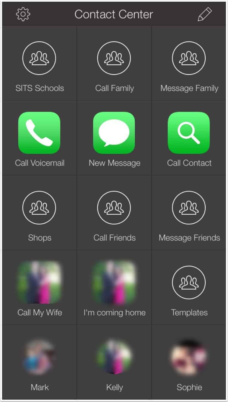
I’ve found that my setup includes all three of these options, with the bottom row consisting of my top three contacts, two rows with Folders configured for Family, Friends and Work. I’ve actually created two Folders for Family, one called Message Family and one called Call Family in order to differentiate between what I would like to do. There is also an individual “speedtouch” button for Voicemail.
Contact Center isn’t just limited to shortcuts for it’s own SMS and Phone/FaceTime actions. What’s App is now included as a configurable action which widens the appeal and versatility of the app. Emails can be configured for individuals or groups of users and Messages too can be sent out to a number of recipients.
I like the fact that when you are creating a Messaging/Email shortcut, you have the option of being able to Ask Each Time or use Predefined Text. The ability to use Touch ID to unlock my phone, open Contact Center and tap a button to automatically send a message to my wife saying that I’m stuck in traffic and I’m going to be late home (unfortunately this happens enough to warrant it’s place as a template) is really handy. This is also applicable to What’s App shortcuts as well.
One feature I haven’t made use of is the ability to Schedule an Alert. Each shortcut you create has the ability for you to create an alert at a certain time, with the notification appearing in the usual manner on your Lock Screen. I can’t explain why I haven’t really used this, I guess I’m used to all of my reminders being configured in either OmniFocus or Reminders so I don’t need another option in my workflow. I have tested it though to check it works as intended and the alerts are as reliable as you would expect, with the level of intrusion being able to be configured in the normal way.
One other difference between Contact Center and Launch Center Pro is the way you interact with the tiles. With Launch Center Pro, when you click on a folder tile, you have to keep your finger on the screen to move across to the sub-tile you wish to select. This isn’t the case with Contact Center. You simply click the folder tile and you can remove your finger while you look for the action that you want to take. This has definitely been put in place for the less-technical user and really points to the fact that Contact Center is designed for a wider market than Launch Center Pro.
I have to say that I was unsure about how I was going to take to Contact Center, mainly because I use Launch Center Pro so much for all of my automation and contact management. However, being able to separate my contacts from Launch Center Pro and just use one specific application has been a worthwhile exercise. I’ve got a very comfortable layout, with nice clear icons for key people. This is important because I’ve shown my 7 year old how to use my phone in the case of an emergency and she needs to phone my wife, so this makes it very easy for her to use.
Beginners can use it straight out of the box, Intermediate users can create more advanced actions however Advanced users, who are looking to use it in the same vein as Launch Center Pro, may be reluctant to make the switch.
On the whole, I think it’s a fantastic application and it will change the way that many people use their iPhones for messaging and contacting people. There is certainly scope for some more extensibility within the app, but it is extremely functional as it is and the free version is going to be more than enough for the majority of users.


