Mail Pilot has been a popular email management application since it was released as a Kickstarter web application in September 2012. It is the brainchild of Alexander Obenauer and Joshua Miles who wanted to find a way of being able to reimagine how email is handled within our modern workflows and uses. It has evolved gradually since then and is now available on all of our Apple devices.
This month marks the introduction of Mail Pilot 2 on iOS and I have been using it regularly since release in order to try to give it the most complete review possible. Email is incredibly important to me because, try as I might, I cannot escape the fact that it seems to be integral to my communication workflow. Some say that the introduction of more unified messaging tools is going to mean that we will be hearing the death knells of email soon – however the amount of applications being released over the last few months tells a very different story. I can certainly point to the (almost) excellent Outlook application that has just made it’s way to iOS.
Let me start by telling you what my pre-Mail Pilot setup was. On OS X, I’m generally swapping between Airmail 2.0 and the native Mail.app. The reason for this is, I’m desperate for Mail.app to be a success for me! I’m currently reading a fantastic book by Joe Kissell – Take Control of Apple Mail and I’m hoping that by the end of this I will be sold on Mail.app once more. Airmail 2 gives me the interoperability out of the box with applications like OmniFocus, Fantastical and Evernote that I crave in an email application. However for the purposes of this review I decided to spend a few weeks using Mail Pilot so that I could test the sync features with its iOS counterpart and immerse myself in what, I am told, is a great experience.
For iOS, I’m now down to one application and that is Dispatch. I use this, once more, because of the built-in integration with other productivity applications. However, Mail Pilot 2 has proved to be an interesting alternative.
So let’s kick it off with services.
If it’s an IMAP email account, Mail Pilot 2 will have you covered. It is currently able to support Google, Yahoo, Outlook.com, AOL, iCloud and any other standard IMAP account. Multiple accounts are supported although I found the interface to start looking a little unwieldy once I had more than three configured. For reference, I configured two Office 365 accounts for the review with no issues as well as a Gmail account.
As you would expect from an application such as Mail Pilot 2, security and privacy are taken very seriously. Mail Pilot 2 will only connect with your email server to send and receive messages. There is absolutely no use of third-party products or accounts.
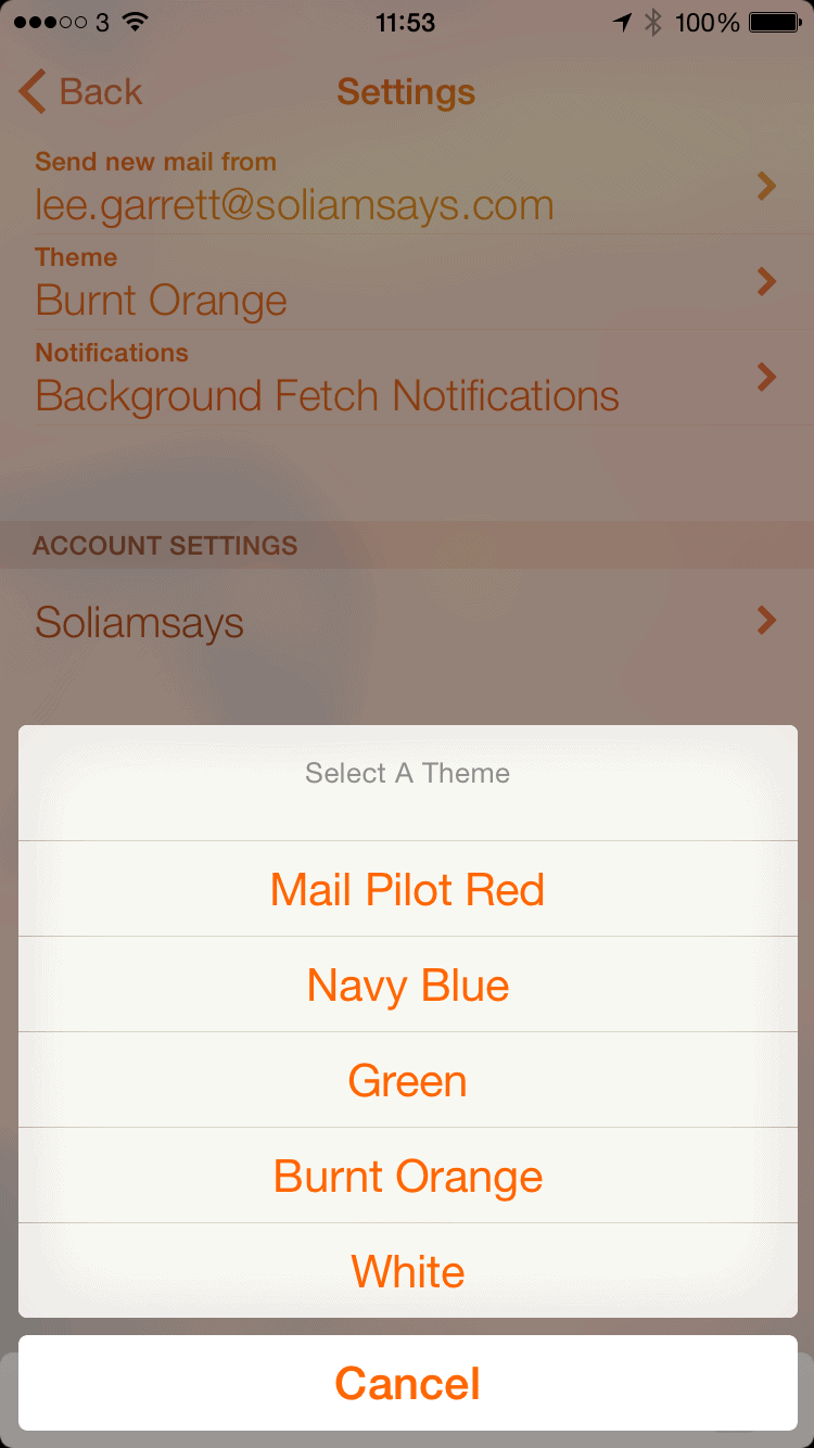
Onto presentation now and visually, Mail Pilot 2 is fantastic. I like using applications that look pretty. This may seem superficial however when you order a meal at a restaurant, you are told that ‘the first bite is with the eye’ and I expect the same standards with the applications that I use. Mail Pilot 2 ticks these boxes with some lovely built-in themes that are subtle on the eye. If you used Mail Pilot, you will know what to expect. The standard has merely gone up a notch. I love the check circles (there is something about square check-boxes that sets me on edge I’m afraid) and the layout is as simple as it needs to be. Top marks.
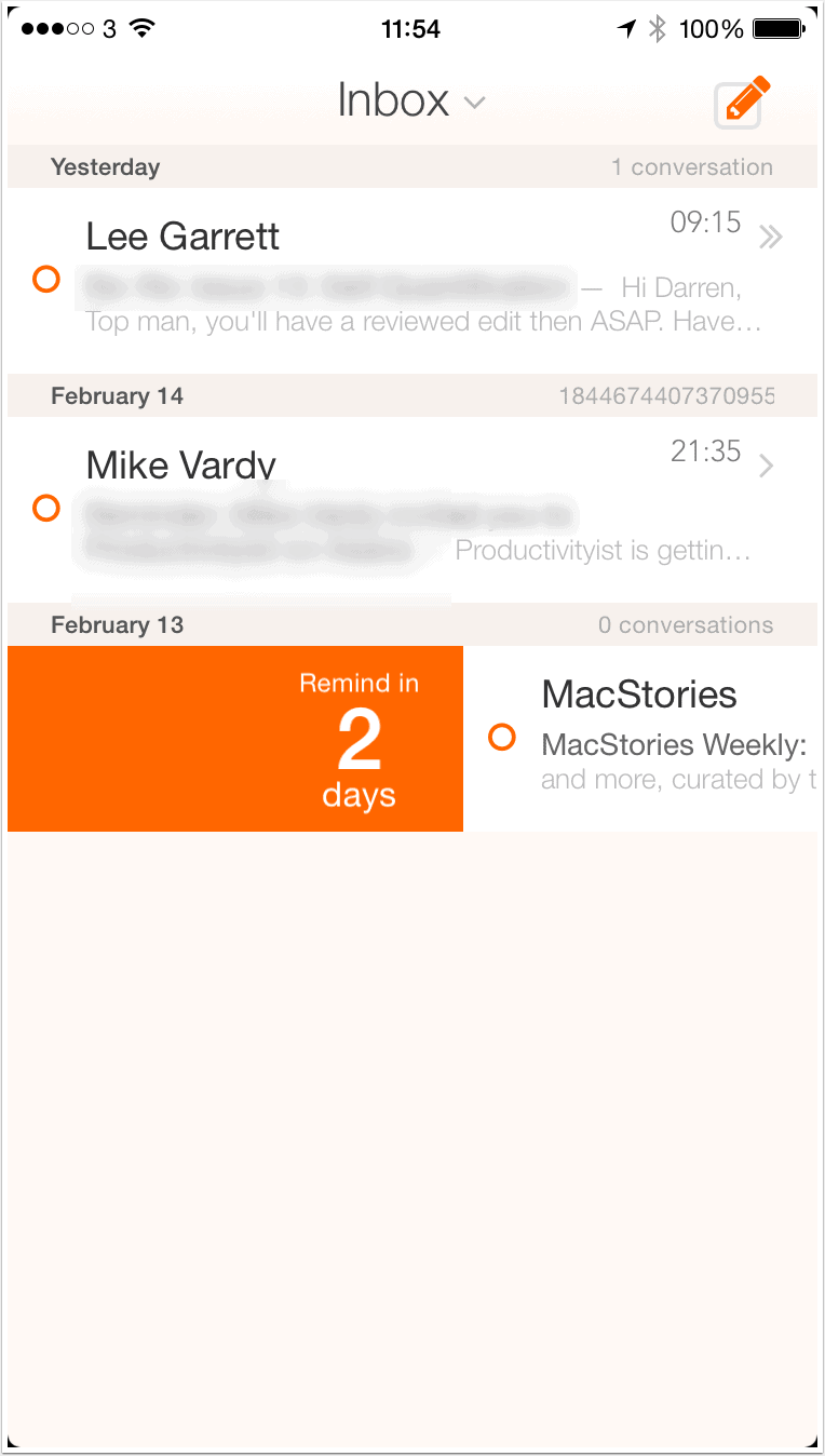
On to functionality and this is where we need to talk about exactly who the Mail Pilot applications are targeted at. If you are one of those people who are prone to using your Inbox as a to-do list, then Mail Pilot was made for you. You do not mark emails as read, you mark them as complete and that’s a really important to consider. When I dive into that theory a little bit more, I actually quite like it. Just because you have read an email, doesn’t mean to say that it has actually been processed effectively and the change in terminology from Read to Completed is starting to resonate with me. By default, swiping to the left you mark the message as complete and swiping to the right allows you to set a reminder for the message. The slower the swipe, the longer you can set the reminder value for, up to a maximum of 3 days (portrait mode) and 7 days (landscape mode). This is nice. One feature I like about the new Outlook app is the ability to be able to simply push emails away until you are ready to see them and this functions in pretty much the same way. This is a trend in email applications that is much-needed and good to see.
If you hold your finger on the message, you have a few more options. A flick to the left will mark as complete, a flick downwards will delete, upwards will place the message in a folder simply called Set Aside (not a procedure I’m keen on in general but I see the benefit for things like newsletters and generic reading) and a flick to the right will place the message into your most recent List. A List in Mail Pilot 2 can be very much likened to a folder where you will keep messages related to a certain project or function. Again, this isn’t something I use regularly because I rely heavily on an applications ability to search rather than my ability to file effectively, however I’ve used it for the purpose of this review and found it to actually improve the last project I worked on. The list was not permanent and I made a point of moving all messages to my archive folder once complete, however it definitely improved my ability to retrieve a message relating to an in progress project.
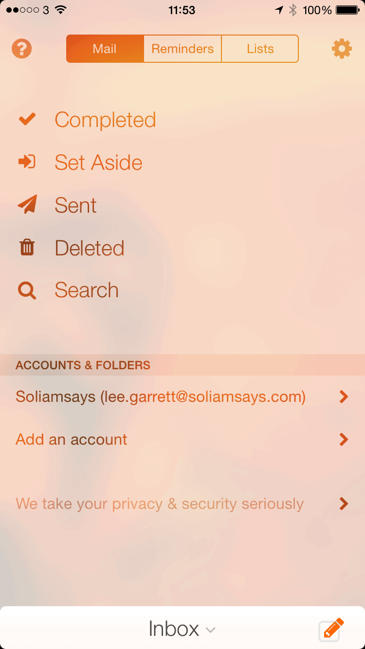
It’s especially good on the OS X version because there are simple, one key shortcuts for Set Aside, Reminder and List which mean that you can cut through your Inbox in minutes. The iOS gesture control for individual messages however is as good as I’ve seen and I would say it ranks alongside Dispatch for ease of use, if not on interoperability with other applications.
One big problem I had – and I know I am not alone in this – is the gesture control to present your Inbox. You need to swipe down from the top middle of the screen. That’s right, in almost exactly the same place as Notification Centre. This was frustrating me almost to the point of uninstall for the first couple of days, however I persisted and trained myself to find the gesture’s sweet spot. Now, I rarely pull down Notification Centre by mistake however I am a patient man needing to sensibly review an application. I wonder how many people will have given up and asked for their no quibble refund?
This is a shame because Mail Pilot 2 is built on the premise that your email is always available, with your inbox always one swipe away. I’m hoping that there will be a way for the developers to work on this. I should also note, that I tested this on an iPhone 6 as opposed to a 6+. My thumb was just able to reach that part of the screen however I’m sure it wouldn’t have been so easy on the larger device.
Attachments from cloud storage providers is covered. iCloud, Google Drive, Dropbox are available for use – the popular Box.net is not however, nor OneDrive from Microsoft which, with their new storage options for Office 365 subscribers, is disappointing.
As well as the problem with swiping down to present your Inbox, I’m afraid to say that I noticed some other glitches with using the application as well. On the iPad, when using it in horizontal mode, the application had a tendency to crash when I was trying to add attachments. This seemed to be predominantly when trying to add from my Camera Roll as opposed to from any storage providers, however this is something that should be dealt with on the first update. Scrolling too could sometimes be glitchy when reading threaded messages.
There are no native push notifications which is surprising for an email application. Don’t get me wrong, for me this makes no difference whatsoever as I try to deactivate all notifications as part of my workflow anyway, however some people need to have these notifications enabled.
All in all, Mail Pilot 2 for iOS is a decent improvement on the first version, with largely intuitive controls and wonderful presentation.. There are, however, quirks that need to be ironed out and this makes me question the price. This is not a cheap application, coming in at $9.99 (with a sale price of $7.99 currently) and this is definitely going to be a barrier of entry for a lot of people.
I would be interested to see what happens with the next update and whether any of the glitches above are rectified. If not, the emergence of free applications like Outlook, as well as the extra functionality provided in applications like Mailbox, Dispatch and Boxer, will make these applications look a lot more attractive.
