 Back when I was doing the Work Awesome podcast, I had the pleasure of interviewing Jesse Jacobs for one of the episodes. He is the founder of Samovar Tea Lounge (based in San Francisco), and occasionally writes over at his weblog, RealRitual.
One of the things that we chatted about after the recording was how we keep our computers organized. I talked to him a bit about how I did it and told him that I’d write a post about it someday. He then had this to say:
“Please do write the post. I’ve not heard or read anything on best practices for folder organization. And, include screen shots!”
Almost one year later, I’m delivering the goods as part of my “How I…” Week. Enjoy.
How I Don’t Organize My Mac
I don’t keep much media on my MacBook Air.
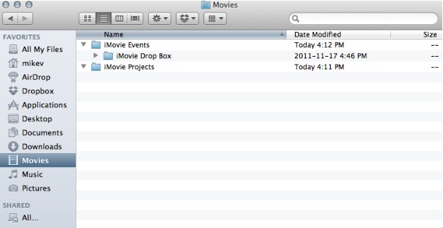
The Air has less than half the storage of my old MacBook Pro, so my goal is always to keep it lean and mean. Check out my Movies folder below…
You get the idea.
Here’s what media I don’t keep locally:
- My main iTunes Library. This was a bit of a problem when you used to have to sync your iDevices directly to your machine. But now with wi-fi syncing and iCloud (sort of), this isn’t something I need to keep on my Air. Even software updates can be done on the devices themselves now. And since I use Instacast for my podcasting needs and Rdio for my music needs, I generally have local music stored on my Drobo for archival purposes these days.
- Movies. They’re on my iPad and stored on my Drobo as well. For the times and amount I watch, it’s not something I need to have stored right on my machine. Having Netflix on my iPad helps as well.
- My main iPhoto Library. Again, we use an external drive for this (that also gets backed up to the Drobo) for this. It’s a 320GB portable drive that my wife and I can share between the family machine (re: my old MacBook Pro) and my Air. That said, much of the photos I want are already on my iPad and iPhone to show people quickly and easily. 1
I don’t keep much on the Dock.
My Dock is kept hidden – and when it does come out to greet me it contains only the following:
- Finder
- LaunchBar
- Asana (run with Fluid.app)
- Sparrow
- Safari
- Evernote
- nvALT
- Byword
- Scrivener
- Downloads Folder
- Trash
If I could get rid of Finder and LaunchBar, I would. But doing so would modify them in a way that I’m not terribly comfortable with, so they are staying put.
I hide the Dock so it gets out of my way and the things I keep on the Dock are the things I use most often. I will also place items on the Dock from time to time that I do need to use for a project so that I get a visual trigger whenever I use my Air. Scrivener is getting that nod right now since I’m working on a book, and any application I’m putting through the paces will end up there during the testing phase as well.2
I don’t use Spaces/Expose.
While my colleague CM Smith has written an excellent piece on using Spaces, I’ve tried it before and just haven’t gotten into it. I don’t want to have to remember what screens can do what right now; I just want to know that my one screen is where everything will be when I open it.
I’m not saying I won’t go down this road once again – but it’s not a priority for me.
How I Do Organize My Mac
I use a ton of automation.
I let Hazel do a lot of the organization for me. I’d be lost without Hazel’s rules in place to help me keep my Mac as organized as possible.
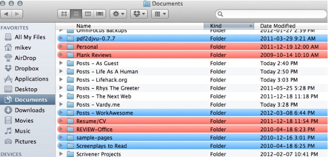
Below you’ll see a portion of my Documents folder, listing all the folders I’ve prefaced with the word “Posts” so that I can immediately know what’s in them. By appending certain letters in front of file names (like “VME” for this weblog), Hazel knows to put what documents into what folder.
The bottom line: If you want to keep your Mac incredibly organized all the time, you really need to pick up Hazel.
I make the Finder my Finder.
I don’t roll with the stock view that Finder has – I modify it to a certain extent. I want to know when a file or folder has been last modified and also when it was opened, and I slide those to where I want them in Finder view.
While Hazel does take care of a lot the sorting for me in other ways, being able to customize the look of my Finder means I get what I need from the Finder window and don’t need to dive into something more robust (and perhaps confusing and conflicting like Path Finder).
I use plenty of folders.
I like folders. A lot.
I don’t stack too many folders inside of others unless they are warranted, but when you look at the top-level folders in Documents, Music and Pictures on my MacBook Air, you’ll see several folders for each project inside. I don’t keep one called “Online Writing” and then stack my various folders that contain my contributions to websites inside those. Instead (as you may have noticed above), I simply keep folders called “Posts – ” and then add the corresponding website to the folder name so I can know what’s what with just a glance. And by using the first portion, I’m able to better narrow down where I have to look in a Finder window to find my drafts for writing online are stored (I simply look for the letter “P” and go from there).
It’s something that works very well for me.
I use colour.
Hazel adds colours to various files as it runs its rules so that I can also identify via colour. For example, any files that haven’t been opened in over 6 months are green and any older than one year are red. So when I see files that are red I know it’s safe to store them off my local drive and I move them to my Drobo.
Since the Mac has 7 colours to choose from, you can run with 7 rules around them. Here’s what I use:
- Red: Files that have not been opened in 1 year or more.
- Green: Files that have not been opened in at least 6 months, but less than 1 year.
- Blue: Files that have been on the machine for 1 week or less.
- Gray: Applications I have not used in 6 months or more.
- Yellow: Applications less than 3 months old.
You’ve still got orange and purple to play with, so use whatever ones will resonate with you 3 and you’ll find that you’ll have a nice quick visual reference for your files, folders and applications that you can count on.
I declutter regularly.
Thanks to Hazel automatically colouring older apps, I can quickly review what I’ve got going on my machine and declutter at will. And you know how much I enjoy decluttering.
(It also helps when I review apps so that I don’t miss any that I’ve stopped using post-review.)
Some Final Thoughts
- Hazel is what makes this all work so well. Read my earlier post this week on Hazel to see if it’s for you – and then go buy it anyway.
- The increasing popularity of web apps has definitely contributed to the freeing up of space on our computers. Choose your web apps wisely; native apps are never a bad option if they can do the job just as well. In fact, they often do it better.
- While I don’t fiddle with this routine all that much anymore (because it works), I do have the guilty pleasure of changing my desktop wallpaper regularly. Right now it is showing the proposed cover to my book – again to keep me on task – but my “Wallpapers” folder is brimming with them. And yes, I do have a rule in place to get wallpapers in there.
If you organize your Mac using a hierarchy that works for you – and let Hazel do a lot of that work for you – you’ll end up doing more work using your Mac than you will working on using your Mac.
And there’s a big difference between the two.
Photo credit: Marcin Wichary (CC BY 2.0)
1 The only media I do keep on my Air are the materials for the podcasts that still need editing, a secondary iTunes library to help with podcast testing and another iPhoto library for images I use for presentations and talks. But that’s it..
2 Apps I’ll be putting in the Dock soon for testing exercises include: Raven, Hibari, Marked, Money and Keyboard Maestro.
3 I know someone who believes that purple is a colour that denotes importance, so there’s that.
