The following is a guest post by Ryan McRae. Ryan is the founder of masterpresenting.com, a blog dedicated to creating courageous presenters. He has spoken all over the world, including Afghanistan. He is an Apple fanatic, voracious reader and lover of things pumpkin flavored. He can be reached at theryanmcrae@gmail.com.
The task of giving a presentation can overwhelm the best of us. We can be overwhelmed by either the fear of generating the content or creating the slides. Usually it’s both.
These oscillating fears, bouncing from one to other causes analysis by paralysis. We start to develop the content and we are quickly overwhelmed by what we want to say. Then to avoid the fear of content, we will think about how we are going to present that info—what should the slides say, what should they look like, etc.
We go back and forth. And some of us cry a little because we are not only trying to eat the elephant in one single bite, we are trying to look good while we do it.
How can you take a step back, create a presentation worth experiencing and not get overwhelmed in the process? How do you create the content and the slides without that slight drowning sensation?
Capture and Curate Content
Let’s imagine that you topic is about “burnout”. You are going to talk to a bunch of professionals about the dangers of burning out of their career. Sounds good.
You Google “Burnout.” You have a million articles and your content curation is causing you to tilt back that bottle of antacids. This isn’t the best move. It’s like going to a buffet and loading everything you see on your plate.
First, download Evernote and install the Chrome extension for it. You’ll be able to capture and curate information you are about to search for. This will save article upon article (and you can use this on the newest iOS system for the iPhone and iPad) for you to delve into later. (You can also tag each article with #burnout for easy searching.)
Culling and Cropping Content
After your capturing method is in place, now you can look for inspiration and sources on “burnout” and click on that little elephant to capture the articles you like.
When you feel you’ve hit the end of the internet, go back to Evernote, start reviewing and most importantly, start culling. Cull with a vengeance. Slash. Burn. This isn’t meant to be an episode of Hoarders.
Look for themes that strike your fancy. And when you are reading these articles, you can highlight phrases you like:

Also, you can add tags to categorize these articles that you are finding.

By capturing, labeling and organizing this material, you are prepared to build your presentation with all the content your little heart desires.
Your Own R&D Department
You’ve gathered, you culled, and now it’s time to develop your presentation. This is the part where you want to fill your slides with bullets, bullets and more bullets because you have ALL this information you want to share with your audience.
This is where you make the mistake.
If this was a first date, you’d never get a second. If this was a surgery, you’d be wheeling the poor fella to the morgue.
You don’t want to overwhelm your audience. You don’t want to bore them.
“But Ryan, they need all of this information.”
They do. Maybe someone is paying you. Maybe this is for your career. I get it. You want to deliver content for your audience that is valuable and relevant.
But if you wreck yourself, while not checking yourself, you will bore your audience and no one will be impacted.
Simple Slides
We’ve seen those slides where they are covered and layered in bullets and words. And when an audience sees that, you can hear the collective powering down of their minds. Here’s why: your brain cannot parallel process. It can’t listen to someone talk while you try to read 90 words on a slide. It won’t default to one or the other. It won’t tune in to one channel or another. It will do neither.
Guy Kawasaki always states there should be 10 words per slide at most.
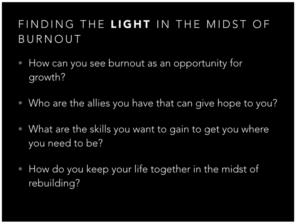
For example, if I was talking about the benefits of burnout with these questions:

Not bad. But you there is a lot of text. And I don’t expect my audience to jot down all of those questions. I’m going to talk about those more. I’m going to interact with the audience.
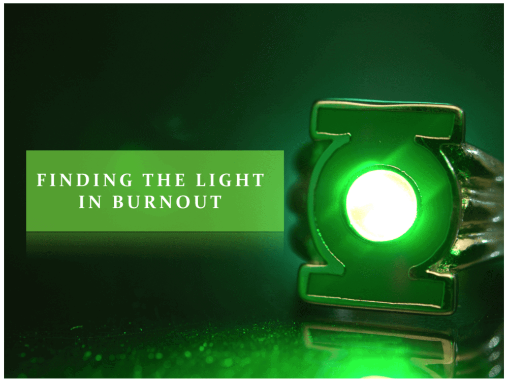
Since I know my audience is a bit geeky and they get pop culture. So I pull out the word LIGHT and focus on that.

That gets their attention and I simply picked a great photo, took the title and put it in a box. My audience can grasp that and as the presenter I get an audience that is engaged instead of bored.
Now there might be more information you want to them to have and you will be sorely tempted to jam more and more slides into your deck. Rookie move my brethren.
Here’s the solution—create a PDF that has the rest of the information and offer it on your site, or simply gather their emails and shoot it to them after the presentation. That curation you used, the information you couldn’t get into your presentation will be valuable to them as a resource.
Presentations can be overwhelming due to amount of content, but by paring it down, disseminating it well, you can rapidly create presentations that matter and impact people.
The following is a guest post by Ryan McRae. Ryan is the founder of masterpresenting.com, a blog dedicated to creating courageous presenters. He has spoken all over the world, including Afghanistan. He is an Apple fanatic, voracious reader and lover of things pumpkin flavored. He can be reached at theryanmcrae@gmail.com.

