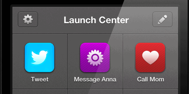
 There are certain apps that an iOS-using productivityist should have close at hand. But many of these apps get buried in organized folders or live beyond the realm of the home screen. That means that having an app much like LaunchBar for iOS isn’t just ideal…it’s essential. That’s why I’m such a big fan of the original Launch Center by App Cubby.
That’s also why I’m an even bigger fan of the developer’s latest release, which ups the ante significantly on its predecessor: Launch Center Pro.
Now I haven’t written about an app here for some time. But Launch Center Pro not only warrants such treatment, but it warrants a piece that bears a resemblance to a typical Home Screen post. Why? Because the app works in a mode that can only be designed as a series of screens as you dive deeper and deeper into it. So what I’m going to do here is break down my Launch Center Pro layout as I go, offering my thoughts on the app throughout.
The Main Screen
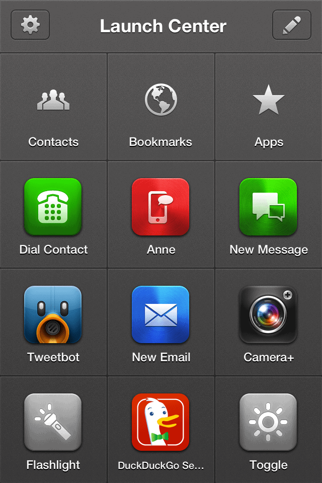
The first screen I see when I open up Launch Center Pro contains the actions I access most often – or at least the ones I’ve added that I use most often. There are some more advanced additions I probably could make to this screen, but I haven’t gone that far down into the app yet in order to figure that out. For example, adding custom URLs hasn’t happened yet, but I’m sure I will at some point.
If you look at the screenshot, you’ll see I can now remove Camera+ and Tweetbot from my iPhone home screen, along with Messages and the simple phone function if I want. Even the Mail app can be kicked from said screen as I can access all of these things (and more) right from within Launch Center Pro’s main screen.
Some of the customizations I’ve either added or kept from the initial download include:
- iMessaging my wife
- Kept Toggle so that I can adjust the screen brightness without having to dig deep into Settings
- Changed the Google search to DuckDuckGo search
- Kept the Flashlight app for those occasions where it can come in handy
- Moved (but kept) the shortcuts for the Groups called Contacts, Bookmarks and Apps
I considered creating a Group called “Social” (and still might), but Tweetbot being on the home screen is fine for now. Plus, I’ve added a couple of other social apps to my next screen.
Speaking of which…
The App Group Screen
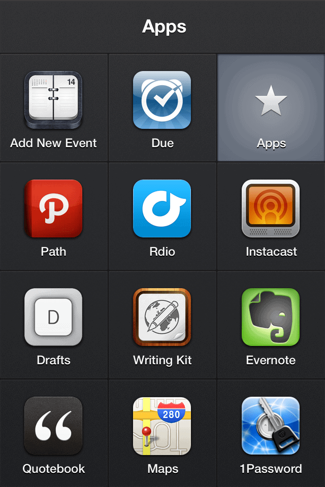
This screen contains all of the apps I use frequently that can also be instantly added to Launch Center Pro. AS you can see on the screen below, I’ve filled this screen to the brim.
Here’s what I’ve got on there:1
- Agenda Calendar
- Due
- Path
- Rdio
- Instacast
- Drafts
- Writing Kit
- Evernote
- Quotebook
- Maps
- 1Password
Other apps I considered adding that are supported include:
- Dropbox. I didn’t add it because i really dont use it all that often on my iPhone.
- Facebook. With Path and Tweetbot holding court, I figured that adding another social distraction would be pretty counterproductive.
- Byword. I’ve seriously considered moving to Byword on iOS because it’s the app I use on my Mac, but for now Writing Kit still wins the day. And, as a result, the coveted text editor spot in Launh Center Pro.
- Dragon Dictation. I’d go with this if I used it more, especially for writing purposes. But I just don’t. So it stays off of Launch Center Pro (but may gain a better location on my iPhone because of other apps moving in to this app.
- Instapaper. Again, I don’t use it all that much on my iPhone. This app may move up a level or two on my iPhone screens in the same way Dragon Dictation might. In fact, I’d say it has a better shot than Dragon.
- Reeder. See Instapaper.
- Skype. I decided to add this app to my Contacts group instead. Makes way more sense there.
- Simplenote. I’m not using it all that much on my iPhone, so it may move up outside of this app. But it won’t take up any space inside of this app right now.
What about the apps I wish I could use with Launch Center Pro? Asana and a newcomer to my iOS devices, 30/30 by Binary Hammer, are at the top of that list.2 As I said on Twitter yesterday:
(If you want to know if your app of choice is supported by Launch Center Pro, App Cubby has put together a handy list. Oh, and if you’re a developer who wants to reap the benefits of making your app compatible with Launch Center Pro, then they’ve offered some help in that regard too.)
The Bookmarks Group Screen
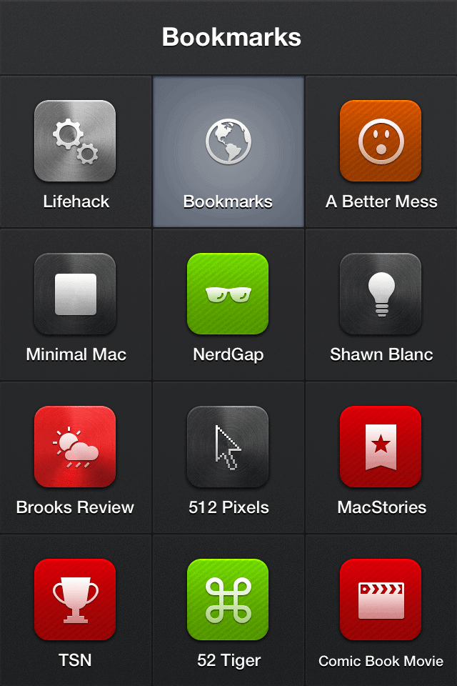
I had a lot fun assembling this screen. Between customizing the icons to best suit the sites I went with (including finding one that is suitable for Lifehack) and narrowing down my bookmark choices, I could’ve spent a ton of time in there. But you’ll see below what I ultimately settled on.
There’s even more customization you can do with bookmarks, but I didn’t even go there – at least, not yet. I’m sure I’ll spend more time on this screen eventually, but I’m quite pleased with the way it turned out. And the customization was simple, elegant and intuitive. Just how I like it.
The Contacts Group Screen
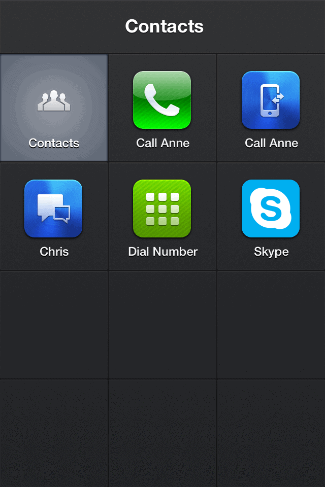
This screen contains the least amount of items – again, for now. I’ve added calling my home number (“Call Anne”) and my wife’s iPhone in there for obvious reasons (she’s by far the person I communicate with most) and then CM Smith (aka Chris) over at Lifehack comes in second.
I still have 6 slots available, but I’m in no real rush to fill them. As I begin to recognize who (or what) else might belong on here, then I’ll edit it once again. But for now simply having the “Dial Number” and Skype options will suffice.
Launch Center Pro allows me to free up my home screen of the apps I use most often that can be launched from the app. That means I can free up said screen for apps that either don’t work and yet I still use frequently, or apps I’m currently testing out. I suppose you could really weigh down the app with numerous quick launches, but I tend to err on the side of moderation. My social network apps and communication-based apps all live there, and even my main iPhone writing app (Writing Kit) is launched from there. It’d be great to have stats on how often an app is used via Launch Center Pro (much like TextExpander stats for Mac tells you how many hours you’ve saved using the app, for example), but I don’t how easily that can be done…if at all.
Launch Center was simple and brilliant. Launch Center Pro is simply brilliant. Go get it now while it’s on sale for only $2.99 in the iTunes App Store. It truly is a productivityist’s best friend.
1 All of these links are either direct affiliate links or link back to other posts where i’ve discussed them. As for which ones…well, telling you that would ruin all the fun now, wouldn’t it)
2 Shortly after emailing the folks at Binary Hammer about adding URL schemes to 30/30, I received an email from Bob Koon (their President and Tech Director) saying, “It currently doesn’t support URL schemes, but that can be added in the next update. Thank you for the suggestion.” Fingers crossed, folks. Fingers crossed
